GROUPIE DESIGN EXERCISE
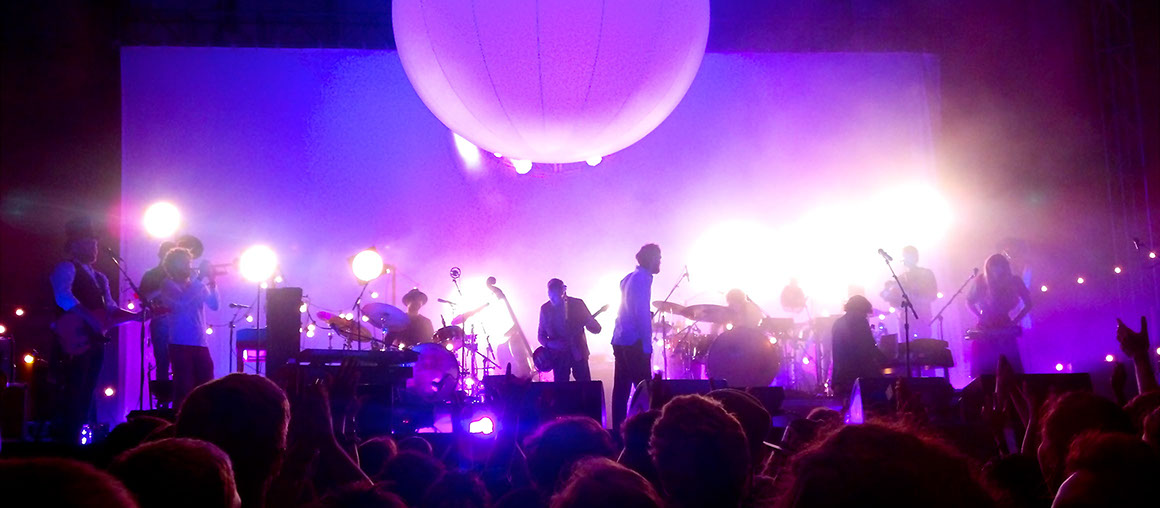
The goal of this design exercise was to quickly think about and iterate on ways that the music festival experience could be improved. As a huge music fan myself and an attendee of a large number of concerts, this was a project I had a lot of fun with. I decided to focus on improving the concert experience for groups of attendees at large music festivals - it has always been notoriously difficult to coordinate between friends and various tastes in music when going to a festival and trying to figure out when and where your favorite artists are playing. Thus, Groupie was an attempt to quickly design a solution that essentially combines a concert scheduling experience with a social aspect to make it easier to coordinate with a large group of people at a festival. Read on to learn about how I typically begin to approach and think about problems.
Group Size
Solo project (early 2017)
Length
5 hours
EXPLORATION
Given the quick timeframe of the design exercise, I knew I was going to be unable to do any meaningful user research and would need to rely entirely on my own personal experience and observations from attending a number of concerts in the past. To begin, I started out by thinking who was the main user, and what their goal would be using this kind of app. Declaring the main user and what their needs or goals were would help create some restraints and give me more direction with which to proceed during this brief exercise.
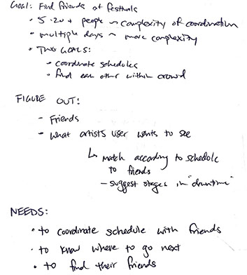
For this experiment, I imagined a group that could be anywhere from about 5-20 people. Because festivals have multiple stages with different performing artists going on at the same time, a common issue that I’ve experienced is not just figuring out when your own personal artists are playing, but what I should do when I have no favorite artists currently playing. If two artists that I enjoy were playing at the same time, I would likely prefer to go to the one that my most friends were going to. From this, I declared three main needs that these users have and would be trying to solve using the app.
These needs were:
- to coordinate schedules with friends
- to know where they wanted to go next, either because an artist was playing that they liked or because a particular stage was where all (or most) of their friends were located
- to find their friends, once they knew what stage they wanted to be at
As a result, I declared the following problem statement:
WIREFRAMES
After figuring out the main needs I wanted to address, I started drawing out possible app flows from a very high level. I wanted to understand a little bit more about how all these moving parts would connect before I created any mockups for the exercise. It was during this wireframing stage that I was hoping to figure out any kinks or issues that my initial ideas of solutions may have had. It was also here where I needed to nail down what the core functionality of my app was and make those features as easy as possible to access at any time.
Thus, I started writing out simple flows made out of text and arrows. When thinking about the app, it made sense to consider it as not just something that was useful when you were at a festival, but something that would also serve a purpose before the festival when trying to plan out your day to eventually see all your favorite artists. It seemed like this was also a natural opportunity to allow the user to find new festivals or purchase tickets so there was incentive to download and keep the app, rather than have it serve no other purpose after a single use at a single festival. As a result, I started mocking up a flow that took place before the festival started, and then another flow once you had arrived at the festival.
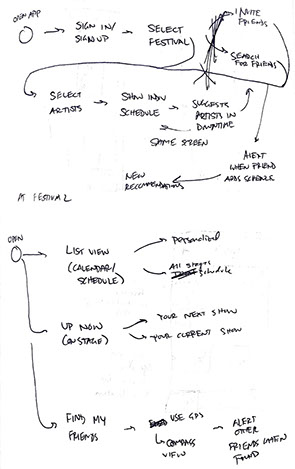
Once the flow was established, I then began to mock up individual screens showing the main functionality of the app. I ultimately decided that the app would have three main views when in use during a festival - On Stage, Schedule, and Friends. I also quickly mocked up what it might look like to try to find friends at the festival, both from the perspective of someone actively trying to find their friends in a crowd, and the perspective of the friends that the person was trying to find so that they could be alerted that their other friend was trying to join them. I’ll go more into detail about these screens later.
MOCKUPS
Given this initial quick exploration, it was time to begin creating screens. I started off with the scenario where the user is either actively looking for new festivals in his area or is trying to find the festival he already has tickets. Thus, this scenario allowed the user to see festivals in his area in the near future, allowing him to buy tickets for that festival or to start planning his experience.
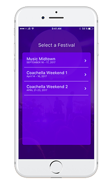
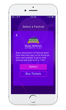
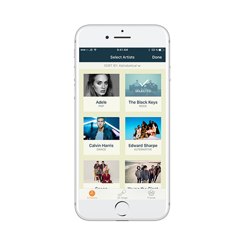
Once the user selects a concert, they enter into the customized view for that festival. Since many festivals have their own unique feel and vibe based off the kind of music or setting at that festival, I thought it was important to give festivals a way to customize how viewing information in the Groupie app looked. This was thought to serve two main purposes - to keep that feeling consistent between the festival experience and in the app, but also make it easier to understand what festival you were currently planning for if a person was planning on attending multiple festivals in the future. For this exercise, I used the main colors of the Music Midtown festival in Atlanta.
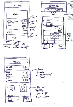
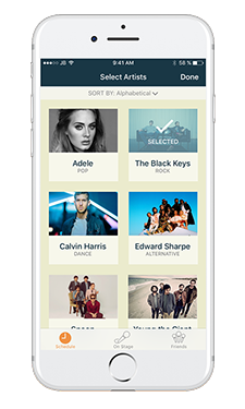
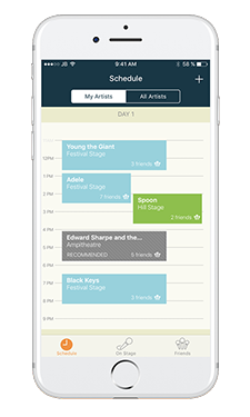
The first view a user sees is the “Scheduling” view. This view allows users to select their favorite artists that they want to track and see how many other friends that are also planning on attending that performance. Users could add artists easily, finding the artist by alphabetical name, genre, or band photo. To select an artist to follow, they would simply tap on the artist’s card. Once a user selects their favorite artists, they would press “Done” and be shown a timeline for the performances of the artists they have selected. In this example, I differentiated between different stages by changing the color of the time box. Users would also be able to see the number of friends that are planning on attending that performance in the bottom right of each calendar entry. If a user has a gap in their schedule, the app would suggest a performance based off similar artists or the number of friends that are attending that performance. Users could also switch easily into a view that showed all artists playing at that time.
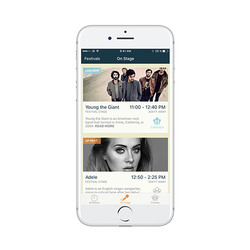
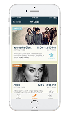
Meanwhile, the “On Stage” view was designed to give the user a better idea of what’s going on now. It shows the currently playing artists, which stage they are playing at, how far away it is, a brief description, and a count of how many friends are currently at that stage. The goal of this screen was to give a better experience once the user was actually at the festival and didn’t want to be overwhelmed with the performances going on later at the festival.
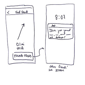
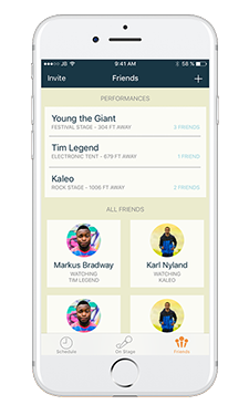
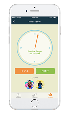
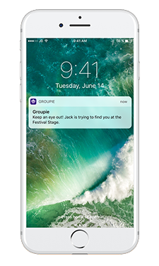
Lastly, I created a “Friends” area of the app, which was dedicated to the people that were attending the festival with you in your friend group. It is here where you could see where all your friends were located now and who was performing at each of those locations. For instance, if you really like music similar to a friend, you’d be able to quickly find him by looking at the Friends area to figure out what stage he is currently at. If you scrolled down, you’d see a card for each friend in your group. Once you arrived at the stage that your friend is at, you would scroll to these cards and select the friend you wanted to meet. It would then visibly show you which direction you should go and how far away that friend was, based off the GPS and compass sensors available in nearly all phones today. If you tapped “Notify”, your friend would be notified that you were trying to find him through push notifications. This was designed with the hope of trying to find your friend as easily as possible, given it can often be difficult when you’re trying to find a friend in the midst of a sea of thousands of other fans.
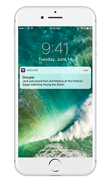
Additionally, I thought about another scenario in which your friends all decided to meet at another stage. In this situation, we would send another push notification to let you know that members in your group just joined other members in your group at another stage, so you don’t miss out on spending times with your friends. I also created a basic logo for Groupie, made up of three microphone-looking people (…or people-looking microphones…?), symbolizing the musical nature of the app but also the social aspect.
At this point, I had run out of time for this particular exercise so no additional work was completed.
DESIGN EXERCISE